
TLDR
Yes, you can absolutely personalize MTG proxies with different frames, artwork, and styles.
The fastest “looks good, prints clean” path is using PrintMTG’s web-based Card Maker: pick a frame, swap art, tweak text, preview live, then print.
The secret sauce is consistency: pick a style once (frames, fonts, art vibe) and apply it across the whole deck.
If your art is low-res, it will look low-res. Cardboard is honest like that.
Check out the PrintMTG Card Maker here.
Let’s start with a card.
Sol Ring (Cat Ring Edition)
Mana Cost: {1}
Type: Artifact
Rules: {T}: Add {C}{C}.
Art: Stock art from Shutterstock. You can also draw your own, or use AI tools.
Frame Pick: Full Art (because subtlety is for basic lands).
Flavor Text (optional): “Purrmanent mana advantage.”
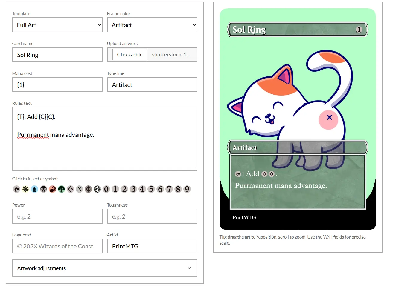
This is silly, of course, but it took me a couple minutes to put together.
That’s the whole point of personalization. Your deck still plays like your deck, but it looks like your deck. And if you want to personalize MTG proxies without juggling five apps, 40 PNGs, and a folder named “final_final_really_final,” PrintMTG’s Card Maker is built for exactly this.
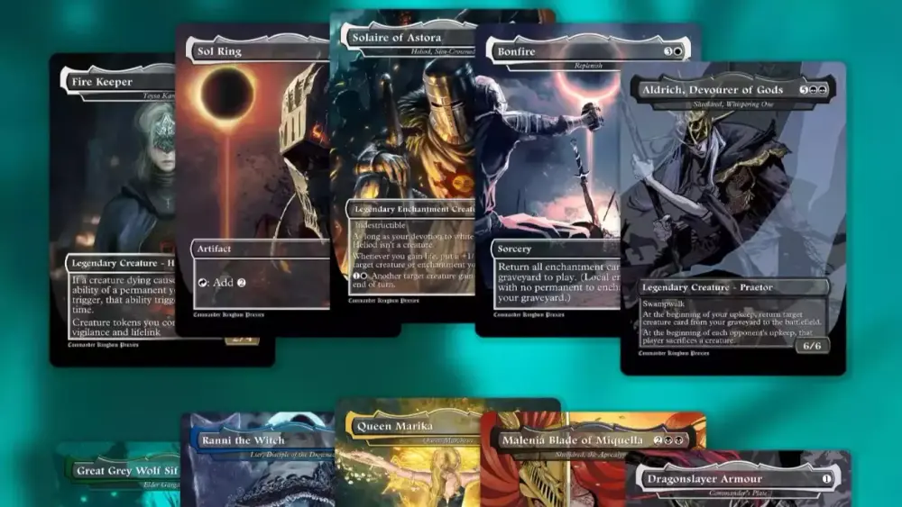
Yes, You Can Personalize MTG Proxies
Personalizing proxies is one of the best parts of the whole proxy workflow. Not because you “need” anime art on your Thoughtseize, but because custom visuals solve real problems:
Theme cohesion: Your deck has a vibe. Your cards should too.
Readability: You can choose versions that are cleaner at a glance.
Memory aids: Tokens, emblems, MDFCs, and weird corner-case cards get easier to track when the visuals match what they do.
Joy factor: The game is better when your cardboard makes you smile instead of reminding you about your credit card statement.
The only “rule” I’d push here is simple: make it obviously custom. Alternate frames, custom backs, tasteful “PROXY” labeling, whatever your style is. You want zero confusion at the table and maximum “oh wow, that’s sick.”
The Easy Button: PrintMTG’s Web-Based Card Maker
If you want a tool that’s actually designed for making custom-looking cards (not “graphic design, but with more crying”), PrintMTG’s Card Maker workflow is refreshingly straightforward.
What makes it good for personalization
Frame variety that looks legit on the table: You can pick from multiple templates (Modern, Vintage, Box Topper, Mystical Archives, Full Art) and match them to your deck’s aesthetic.
Start from a real card, then customize: Search a card name to auto-fill the boring parts (name, mana cost, rules text, artist fields), then overwrite whatever you want.
Art control that doesn’t feel like a hostage negotiation: Upload your own artwork, drag to position, scroll to zoom, and fine-tune scale.
Live preview: You see problems immediately (typos, cramped text, awkward cropping) before you print anything.
Print pipeline attached: Once it’s designed, you’re not stuck exporting, resizing, and hoping you didn’t accidentally save the “thumbnail” version.
A practical “don’t mess this up” mini-checklist
If you’re customizing a card, check these before you call it done:
Card name is readable (from arm’s length, not microscope distance).
Rules text is clean (no tiny fonts, no low-contrast text over busy art).
Art crop feels intentional (faces not clipped, focal point centered).
Symbols and icons aren’t fuzzy (fuzzy mana symbols look like printer errors even when they aren’t).
That’s it. Not a pilgrimage. Just a quick quality pass.
Good, Better, Best: Three Levels of Proxy Personalization
Here’s a simple framework that keeps you from going full perfection goblin on day one.
Good: “Swap the art, keep it playable”
Best for: a few staples, a new Commander deck, quick upgrades.
Pick one frame style you like.
Upload alt art you love.
Keep text and layout standard and readable.
Result: your deck looks custom without becoming a design project.
Better: “Cohesive deck theme”
Best for: decks you play a lot, pet decks, signature builds.
Choose 1–2 frame styles for the whole deck (example: Full Art for creatures, Modern for everything else).
Set a consistent art direction (cyberpunk, vintage oil painting, Saturday morning cartoon).
Make matching basics and tokens.
Result: the deck feels like a finished product, not a stack of unrelated cool images.
Best: “Full identity system”
Best for: cubes, long-term Commander staples, gift decks, content creator builds.
Build a small “style bible”: frames, fonts, icon style, token look, and even a consistent border philosophy.
Make multiple versions of key cards (example: readable version for gameplay, splashy version for vibes).
Standardize your token suite so the deck plays smoother.
Result: you have a deck that looks like it came from its own plane. In a good way.
And yes, this is where people start making matching emblems. You know who you are.
Where to Get Artwork (Without Making It Weird)
You’ve got a few sane options, depending on what you’re trying to build.
1) Use art you own or commissioned art
If you’re commissioning, the best results come from giving the artist the card’s vibe and a composition hint (portrait vs landscape, focal point placement, “leave room for the title bar”).
2) Use existing art with permission
Plenty of artists are cool with fan projects if you ask, credit, and don’t act shady. If you’re sharing your designs publicly, be extra careful here.
3) Generate AI art for a theme deck
This is popular for one reason: it’s fast.
Two tips if you want it to look good on a card:
Ask for simple backgrounds when the frame already has a lot going on.
Favor strong silhouettes and clear focal points (busy detail turns into mush once it’s shrunk to card size).
If your goal is “my entire deck is Studio Ghibli-coded frog wizards,” AI is basically a cheat code.

Make It Print Clean: 5 Design Rules That Actually Matter
Personalization is fun. Printing is where reality lives. If you want your custom proxies to look sharp in-hand, these are the rules that pay rent.
1) Resolution is not optional
If the source art is small, it will print soft. Period.
For card-sized printing, you want artwork that still looks good after it’s scaled down and cropped. If the smallest dimension is under roughly “a thousand-ish pixels,” expect problems unless you have a clean upscale workflow.
2) Avoid tiny borders unless you enjoy suffering
A thin border looks classy until the cut is a hair off and suddenly every card looks like it has a white outline on one side. Full-bleed and thicker borders are both more forgiving.
3) Give the edge some breathing room
Keep important details away from the trim edge. Titles, mana costs, and power/toughness boxes should not be flirting with the guillotine.
4) Contrast beats “artsy” every time
If your rules text is dark gray on a textured dark background, it might look cool. It also might play like a prank. Make it readable.
5) Consistency makes a deck feel premium
Even if every individual card is beautiful, a deck can still look chaotic if you mix five unrelated frames and ten different font vibes. Pick a lane. Your future self will thank you.
Personalizing a Whole Deck Without Losing Your Weekend
If you’re doing more than a couple cards, you need a workflow. Here’s a simple one that scales.
Step 1: Decide your “deck look” in 3 choices
Primary frame (your default)
Special frame (for commanders, key engines, or signature cards)
Art direction (one sentence: “neon noir,” “retro fantasy,” “cozy watercolor,” etc.)
Step 2: Start with the repeat offenders
Personalize the cards you see constantly:
Commander(s)
Sol Ring / staples
Signature wincons
Your most common tokens
Step 3: Batch the rest in waves
Do not attempt 100 cards in one sitting unless you’re trying to disappear from society for a week. Do 15–25 at a time, keep your style consistent, and move on.
And yes, once you have a style you love, this is where PrintMTG’s “design then print” flow shines. You’re not rebuilding the pipeline every time you want to upgrade a list.
Common Problems (And the Fast Fix)
Problem: The art looks blurry on the card.
Fix: Use a higher-res source, or upscale carefully. If the original is tiny, you can’t “enhance” your way out of physics.
Problem: Text feels cramped or ugly.
Fix: Shorten flavor text, tighten wording, or choose a frame that gives the text box more space.
Problem: The card looks great on screen but muddy in print.
Fix: Increase contrast, avoid mid-gray text, and don’t rely on subtle gradients to carry readability.
Problem: Random white slivers at the edge.
Fix: Use bleed and avoid hairline borders.
FAQs
Can I personalize MTG proxies with different frames for each deck?
Yes, and it’s one of the cleanest ways to keep decks visually distinct. Many players use one “signature frame” per deck so you can spot cards instantly when you’re sorting or rebuilding.
Can I use custom artwork on proxies I print through PrintMTG?
Yes. The Card Maker is built for uploading your own art and placing it into a frame, with live preview so you can adjust cropping and scale before printing.
What resolution should my artwork be?
Bigger than you think. Card-sized printing rewards clean, high-resolution sources. If your art is small, the softness will show most in fine details like faces, linework, and small symbols.
Can I make matching custom tokens and basics too?
You should, especially if your deck makes the same tokens repeatedly. Matching tokens reduce table clutter and make gameplay smoother.
What’s the fastest way to make a deck look cohesive?
Pick one primary frame, stick to one art style, and personalize only the “most seen” cards first. You’ll get 80% of the aesthetic payoff with 20% of the work.