
TLDR
Yes. You can absolutely design FIFA-like cards and Magic: The Gathering-style cards for personal use without paying for expensive software.
For Magic cards, the easiest free starting point is our MTG Card Maker, because it already handles the frame, symbols, text fields, artwork placement, and live preview.
For FIFA-like cards, the best free “template” is often not a finished download. It is a clean blank sports-card layout built in a layered editor using official ratings pages as your visual reference.
If you plan to print either style, use standard MTG-sized dimensions: 2.5" x 3.5" trim, 0.125" bleed, and 300 PPI as your baseline.
This post helps hobbyists design FIFA-like cards and Magic: The Gathering-style cards for personal use by explaining which free resources actually matter, so they can build cleaner custom cards without wasting time on bad templates.
Most custom card projects fail for boring reasons. The art is too small. The text is too close to the edge. The frame looks fine on screen, then prints soft or crooked. And half the time, the “free template” was really just a flat image that was never meant to be edited.
That is why I would split this into two tracks. If you want Magic: The Gathering cards, start with a tool that already understands the card structure. If you want FIFA-like cards, start with a visual system and build your own blank template around it. That sounds less convenient, but it usually gives you a better result.
Start With the Fastest Free Option for Magic: The Gathering Cards
For Magic cards, I would not overcomplicate this. Our MTG Card Maker is the strongest free starting point because it already gives you the pieces that usually eat up the most time: frame selection, editable mana cost, type line, rules text, flavor text, artist credit, artwork upload, art repositioning, symbol insertion, and a live preview as you work. It also lets you search a card to prefill core fields and then overwrite anything you want.
That matters because Magic-style cards are not just art on a rectangle. They have a very specific information hierarchy. The name line, mana cost, art box, type line, rules text, and power/toughness box all have to feel balanced. When one of those zones is off, the whole card reads like a fan mockup instead of a finished piece.
So if your goal is to make custom commanders, alt-art cards, tokens, reskins, or fun one-offs for your playgroup, our card maker is the cleanest path. You spend your time on the card idea instead of wrestling with spacing.
What Actually Counts as a Useful Free Resource
A lot of people go searching for “free templates” when what they really need is a resource stack.
A good custom card workflow usually needs four things:
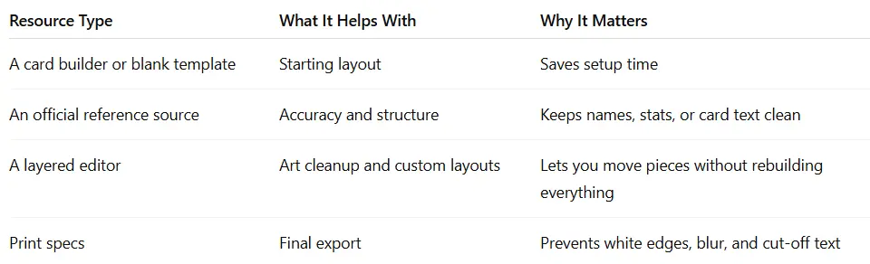
That is the real trick. The best free resource is not always a downloadable PSD. Sometimes it is an official database, a ratings page, or a print spec sheet that keeps your layout from drifting off the rails.
The Best Free Resources for FIFA-Like Card Design
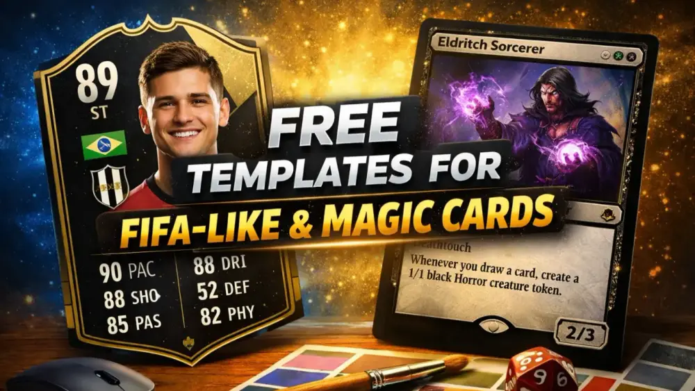
For FIFA-like cards, I would use official football ratings pages as the visual reference, not as something to copy 1:1, but as a guide to the information hierarchy. The official ratings layout consistently emphasizes a few things: overall rating, position, nation, team, and the six face stats that players recognize right away: PAC, SHO, PAS, DRI, DEF, PHY.
That gives you the skeleton of a good sports-card template. Once you understand that hierarchy, building a clean FIFA-like card becomes much easier:
large overall rating near the top
clear position label
strong player portrait
smaller nation and team markers
six-stat grid with tight alignment
one or two accent shapes, not fifteen
This is also why I usually recommend building a FIFA-like card instead of hunting for an “exact” template. What makes those cards feel right is not a perfect clone. It is the balance of the layout.
A good free setup for this style is simple. Use a free layered editor for the card frame and portrait masking, an open-source font library for strong headline and stat fonts, and a reusable media source for things like flags, generic icons, and background textures. Officially, there are free browser-based editors with full PSD support, free open-source desktop editors, font libraries that are open source and usable in print, and free media repositories with reuse guidance.
My advice is to keep the asset choices generic. Use your own club-style marks, your own color system, and your own frame shapes. That keeps the project personal and gives you more room to make the card look polished instead of overly imitative.
The Best Free Resources for Magic: The Gathering-Style Cards
Magic works differently. A sports card is mostly a poster with stats. A Magic card is a rules object. So your best free resources are the ones that help with structure, text, and print readiness.
First, again, use our MTG Card Maker when you can. It already handles the hardest part, which is the card framework itself.
Second, use the official Gatherer database when you need to confirm wording, card names, or Oracle-style text flow. Wizards describes Gatherer as the go-to source for card text and Oracle updates, which makes it the safest reference point when you want a custom card to read like a real Magic card.
Third, use official card image galleries and current card layouts as inspiration for spacing and visual rhythm. That is especially helpful if you are making custom versions that try to feel modern, showcase-heavy, or closer to current design language.
And fourth, respect print specs from the start. If you are building outside the card maker and creating your own file, PrintMTG’s guidance is straightforward: 2.5" x 3.5" trim, 0.125" bleed on all sides, critical elements kept 0.125" inside the trim, and 300 PPI as the baseline for full-card art. That translates to 750 x 1050 px at trim, or larger if you are including bleed.
That is the difference between a card that looks clean in a sleeve and one that comes out with soft text or mystery white edges.
My Recommended Free Workflow for Each Style
If I wanted the simplest possible setup, this is what I would do.
For Magic: The Gathering-style cards, I would start in our MTG Card Maker, import or manually build the card, adjust the art, check the live preview, and only move to a separate editor if I needed a truly custom frame or special compositing. That keeps the templating work to a minimum.
For FIFA-like cards, I would open a free layered editor, set up a standard trading-card canvas, place the portrait first, then build the stat hierarchy around it. I would use official ratings pages as my visual reference and an open-source font library for the typography. That gives you a cleaner, more original result than grabbing some random flattened template from the internet.
In both cases, I would test one card before building twenty. Print one. Cut one. Sleeve one. That single test catches more problems than an hour of zooming in and out on a monitor.
Common Mistakes to Avoid
The first big mistake is chasing the wrong kind of template. A flat PNG is fine for inspiration, but it is bad for editing. You want layers, editable text, and the ability to move art without wrecking everything.
The second mistake is ignoring size and bleed. A design can look sharp on screen and still print badly if it was built at the wrong size or exported too small. PrintMTG’s file guidance is blunt for a reason: incorrect size, no bleed, scaling in the print dialog, and low-resolution internet images are the fastest way to make a card look rough.
The third mistake is using too many effects. Sports cards and Magic cards both look better when the hierarchy is clear. One strong background, one focal portrait or art box, and clean typography will usually beat a pile of glows, bevels, and gradients.
The fourth mistake is forgetting that reference sources are resources too. Official ratings pages, official card databases, open-source font libraries, and reuse-friendly media libraries save time because they reduce guesswork.
So What Do I Recommend?
If you want the short version, here it is.
For Magic cards, use our MTG Card Maker first. It is free to start, it already understands the card layout, and it removes most of the formatting pain.
For FIFA-like cards, use a free layered editor and build your own clean sports-card template using official ratings pages as your layout model. That is usually better than downloading a questionable file from some random corner of the internet.
And if you plan to print either one, build to the right size from the beginning. That one habit solves a lot of headaches before they start.
FAQs
Can I Use the Same Card Size for FIFA-Like Cards and Magic Cards?
Yes. If you want them to feel like standard trading cards in hand, 2.5" x 3.5" is the usual target. That is also the size PrintMTG uses in its print guidance for MTG-sized cards.
Do I Need 600 DPI for Good Results?
Usually no. 300 PPI at final size is the standard baseline. Going higher only helps if your source art is truly high resolution and your file handling stays clean.
What Makes a FIFA-Like Card Feel Right?
The big things are the overall rating, position, portrait crop, nation/team markers, and the six-stat layout. The official ratings pages show that hierarchy very clearly.
Where Should I Check Magic Card Text or Wording?
Use the official Gatherer database when you want wording, Oracle-style text, or a clean reference for existing cards.
Is It Better to Download a Template or Use a Card Maker?
For Magic, I would use a card maker first because the structure is more complicated and easier to break. For FIFA-like cards, a layered blank template is often the better approach because the design is more poster-like and more flexible.