
This post helps casual MTG players make MTG custom Mystical Archive cards using the PrintMTG Card Maker, so you can playtest, reskin staples, or build a whole “wizard library” vibe without becoming a part-time graphic designer.
TLDR
Mystical Archive style is that Strixhaven “illuminated spellbook” frame. It looks amazing on instants and sorceries and mildly ridiculous on everything else (in a fun way).
The easiest workflow is import an existing card, then swap the art and tweak the text.
Your two biggest enemies are low-res art and no bleed. Both will hurt you and neither will apologize.
PrintMTG’s MTG Card Maker has a Mystical Archives template, live preview, and art positioning controls so you can get it right before you print.
You know that feeling when you cast Demonic Tutor and your table suddenly becomes a Renaissance painting of bad decisions? That’s the Mystical Archive vibe. It’s all scrollwork, dramatic art, and “yes, I really did spend time making my Opt look like an ancient manuscript.”
So let’s do the thing. This is how to make MTG custom Mystical Archive cards with the PrintMTG Card Maker, in a way that looks clean on the table and does not require a second monitor dedicated to “why is this cropped weird.”
What is “Mystical Archive” style, and why does it slap?
Mystical Archive was a special Strixhaven bonus sheet featuring iconic instants and sorceries with showcase frames and alternate art treatments. The key part for you is the frame language:
A decorative border that reads like an old spell page
High-contrast text areas (good for readability if you do not cram a novel into rules text)
Art that often looks best when it has a strong focal point and clear composition
When people say “custom myst cards,” they usually mean, “I want my spells to look like they were found in a locked library under a haunted university.” That’s Mystical Archive. And it’s a perfect target for custom proxies because most Commander decks have a pile of staple spells that you see constantly.
Pick your build type: three ways to do MTG custom Mystical Archive cards
Here’s the quick framework. Pick the lane that matches what you’re actually trying to accomplish.
1) The Reskin (fastest, cleanest)
Goal: Keep the real card’s rules, swap the look.
Use it for: Staples like Counterspell, Swords to Plowshares, Cultivate, tutors, board wipes.
Why it works: You get correct templating immediately, then you just do art and vibes.
2) The Custom Card (most fun, most danger)
Goal: Make a brand-new card with your own rules text.
Use it for: Custom commanders, inside jokes, “my friend is a goblin” birthday cards.
Tradeoff: You are now responsible for the card’s clarity, balance, and whether it creates a rules argument that lasts longer than the game.
3) The Utility Piece (secretly the best)
Goal: Tokens, emblems, reminder cards, “spellbook” references, dungeon helpers.
Use it for: Things you constantly forget, like what your commander’s third mode does.
Why it rules: It upgrades table clarity more than yet another fancy Lightning Bolt.
If you’re new, start with the Reskin. You’ll get a win fast, and your brain will stop screaming.
How to make MTG custom Mystical Archive cards with the PrintMTG Card Maker
This is the straightforward workflow. No mystical rite required.
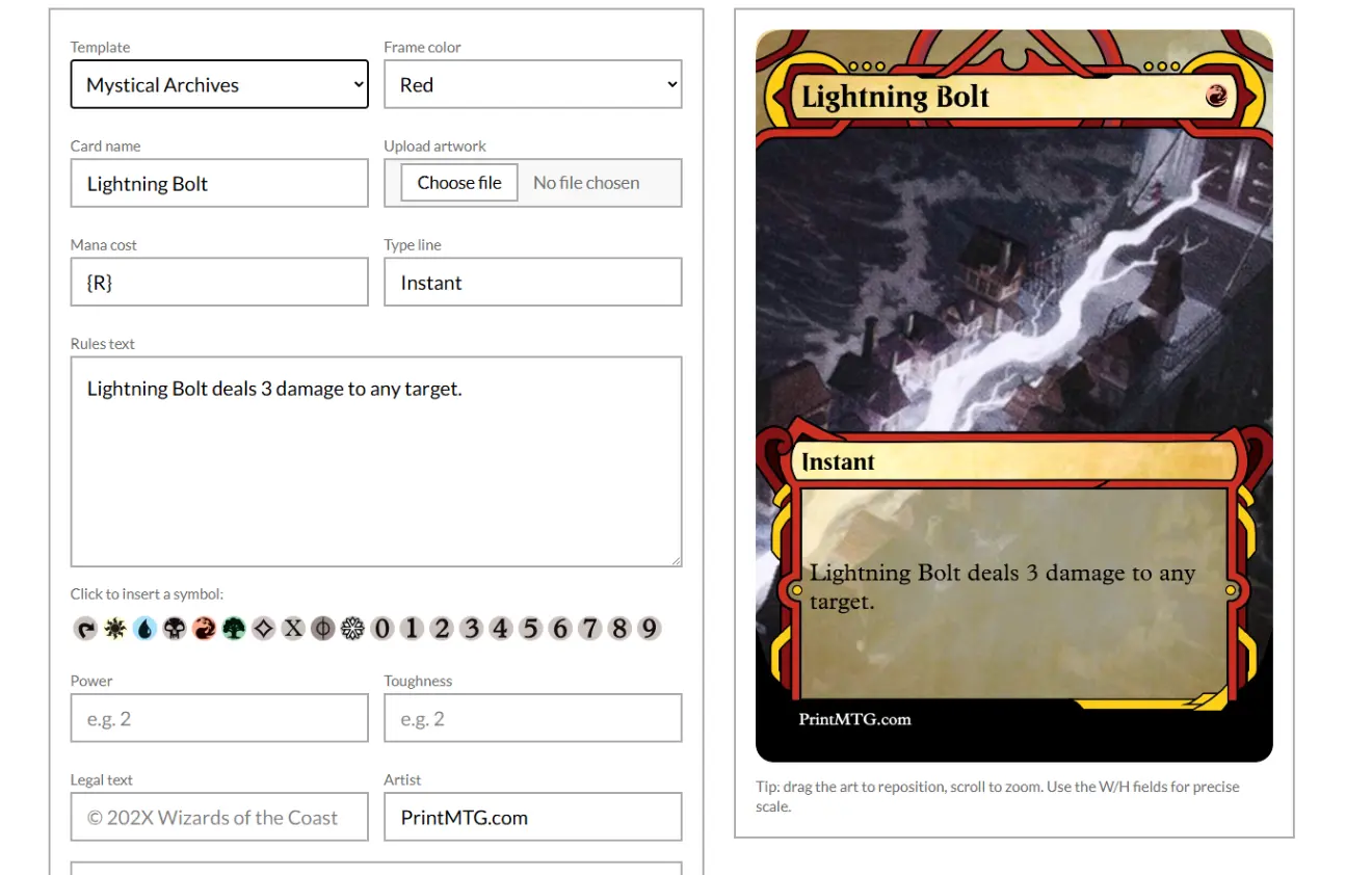
Step 1: Choose the Mystical Archives template
In the PrintMTG Card Maker, pick Template: Mystical Archives. You’ll immediately see the frame style in the preview, which is nice because you do not have to “imagine it” like you’re ordering paint from a 1997 catalog.
Step 2: Import a real card (even if you plan to change everything)
Use the built-in search to pull in an existing MTG card’s:
Name
Mana cost
Type line
Rules text
Artist credit (if you want it)
Art (which you can replace)
This is the biggest quality-of-life move because it gives you correct formatting, correct symbols, and fewer typos. You can still overwrite anything afterward.
Step 3: Upload your art and frame it like you mean it
Upload your artwork, then use the positioning controls:
Drag to move the art
Scroll to zoom
Use X/Y/W/H fields if you want precise control (or if you enjoy numbers, no judgment)
Mystical Archive frames are ornamental, so composition matters more than usual. Center the focal point. Avoid cutting off faces. Try not to make the coolest part of the image sit under a decorative border like it’s being censored by the frame.
Step 4: Clean up rules text so it stays readable
This style looks best when the text box is not a wall of tiny font. A few tips that save you:
Shorten flavor text or remove it if the rules are already long
Use line breaks intentionally so it scans quickly
If you’re doing a fully custom card, read it out loud once. If you stumble, the card needs editing.
Also, symbols matter. Use the symbol insert options for mana and tap icons so the final print stays crisp.
Step 5: Do a quick “print sanity” check
Before you hit order, run this checklist. It’s boring, but so is reprinting because your spell has a surprise white border.
Print sanity checklist
Art goes to the edge (use bleed when available)
Important text is not hugging the border (safe zone)
Nothing is blurry at preview size (low-res art will not magically get sharper in print)
Spacing looks intentional (especially on long rules text)
If you want a deeper explanation of bleed and safe zones, you do not need to reinvent printing math. You just need to follow the spec.
Art tips that make Mystical Archive cards look “real” on the table
Not “real” as in “trying to mimic official security features.” Real as in “this looks like a cohesive card and not a JPEG held together by hope.”
Pick art with a clear focal point
Mystical Archive frames are busy. Your art should not be. If the image is all fine detail and no subject, the frame will win and your card will look muddy.
Use high-res images (and do not upscale trash)
If your source art is small, scaling it up just creates bigger blur. Start with art that’s already clean at card size.
A practical rule: if the art looks soft on your screen when viewed near final size, it will look softer in print.
Embrace contrast
Mystical Archive style loves bold values. Dark background art with subtle details can get swallowed once it’s framed and printed. Choose art that reads well from across the table.
The “don’t hate yourself later” print checklist
If you are printing anything, ever, these are the classic failure modes.
No bleed: creates thin white edges if the cut shifts even a hair
Text too close to the edge: looks cramped, risks trimming
Accidental scaling: “Fit to page” is the polite way printers ruin your life
Crunchy text: usually caused by low-res sources or overly compressed exports
If your goal is a clean shuffle-ready deck, consistency matters more than perfection. Clean trim, correct size, readable text. That’s the whole game.
Printing your custom Mystical Archive cards through PrintMTG
Once your design looks right, printing is the easy part. Add the card(s) to your order, set quantities, and you’re done. PrintMTG produces on-demand cards on premium stock with a durable finish, so your custom spellbook cards feel consistent in sleeves and hold up to actual shuffling.
If you’re doing a whole deck’s worth of Mystical Archive reskins, make a small batch first. Your future self will appreciate the test run.
PrintMTG resources
FAQs
Can I use the Mystical Archives template for creatures or lands?
You can. The question is whether you should. The Mystical Archive look was built for spells, so creatures and lands can feel visually “off,” but that can also be the point if you’re going for a themed deck.
What resolution should my custom art be?
Aim for art that’s sharp at final card size. If the preview looks blurry before printing, the print will not improve it. Start with high-res sources whenever possible.
Why do I get tiny white borders on printed cards?
Almost always: no bleed or scaling. If your art stops exactly at the trim line, any tiny cut shift can expose a sliver of unprinted area. Build with bleed, and avoid “fit to page” style scaling.
How do I keep rules text readable in Mystical Archive style?
Keep it tight. Use line breaks. Cut flavor text if the rules already run long. The frame is decorative, so clarity needs to be intentional.
Can I save and iterate on versions?
Yes. The smart play is to make Version 1, print a small batch, then adjust based on what you notice in-hand and in sleeves.