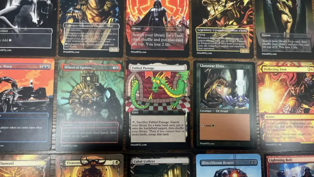

This post helps MTG players pick the right custom card template by using a simple decision tree, so their printed proxies and customs look great and read cleanly on the table.
TLDR
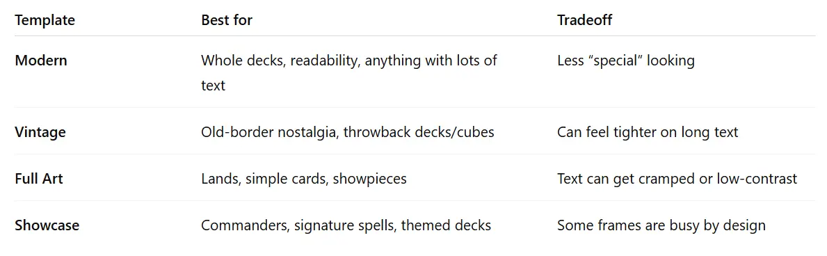
Pick Modern if you want the “normal MTG card” look and maximum readability.
Pick Vintage if you want old-border nostalgia and that classic pre-2000s vibe.
Pick Full Art if you want the artwork to do the talking (great for lands, not great for novels).
Pick Showcase if you want a themed, premium treatment (Box Topper and Mystical Archives live here).
If you’re printing a whole deck and you don’t want to think: Modern for most cards, Full Art for lands, Showcase for your commander and a few signature spells.
You can absolutely spend 45 minutes agonizing over a frame choice for a card that taps for one mana. That’s not a bug. That’s Magic.
And if you’ve ever stared at a template dropdown thinking “why are there so many vibes,” you’re in the right place. MTG custom card templates are mostly about two things: readability and aesthetic commitment. Let’s pick yours and move on with our lives (or at least pretend we will).
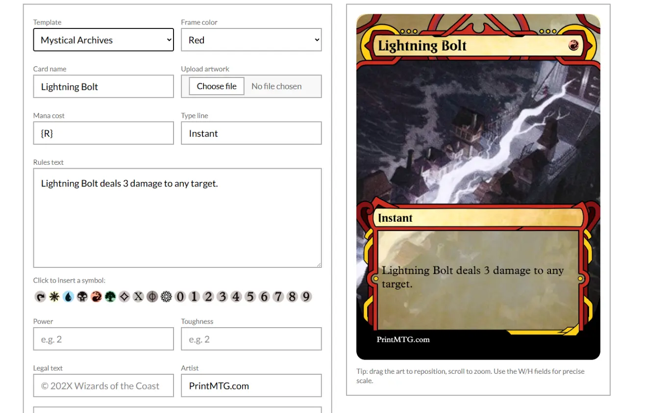
Check out our Custom MTG Card Maker. Make and print your own proxies in under a minute.
The pick-a-template decision tree
Start here. Answer honestly. The cards can tell when you’re lying.
Step 1: What’s the main goal?
“I want it to look like a normal MTG card.”
→ Modern“I want it to look like Magic back when rules text was printed on parchment.”
→ Vintage“I want the art to flex. The text can figure it out.”
→ Full Art“I want a special treatment that feels like it came out of a fancy pack.”
→ Showcase
Step 2: Quick text-density check (the part people ignore, then regret)
Lots of rules text, multiple abilities, weird formatting
→ Modern (or a clean Showcase)Medium text, normal creature/spell
→ Modern, Vintage, or Showcase (pick vibe)Minimal text (lands, simple permanents, iconic splash cards)
→ Full Art is safe and looks incredible
Step 3: Are you printing a full deck or just a few cards?
Full deck: default to Modern for consistency
A handful of upgrades or “signature” cards: Showcase is your best friend
Lands package: Full Art is the easiest “instant upgrade” you can buy
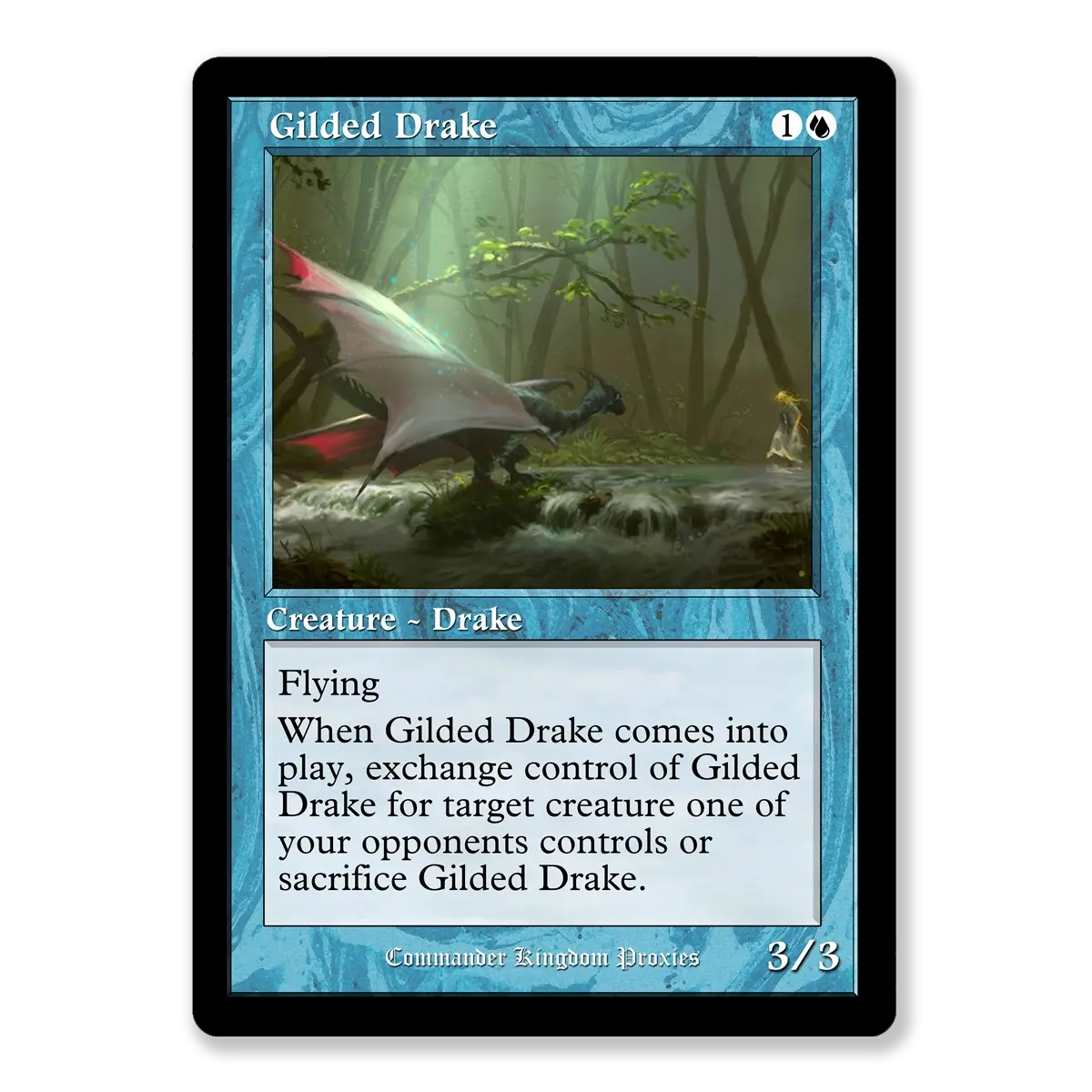
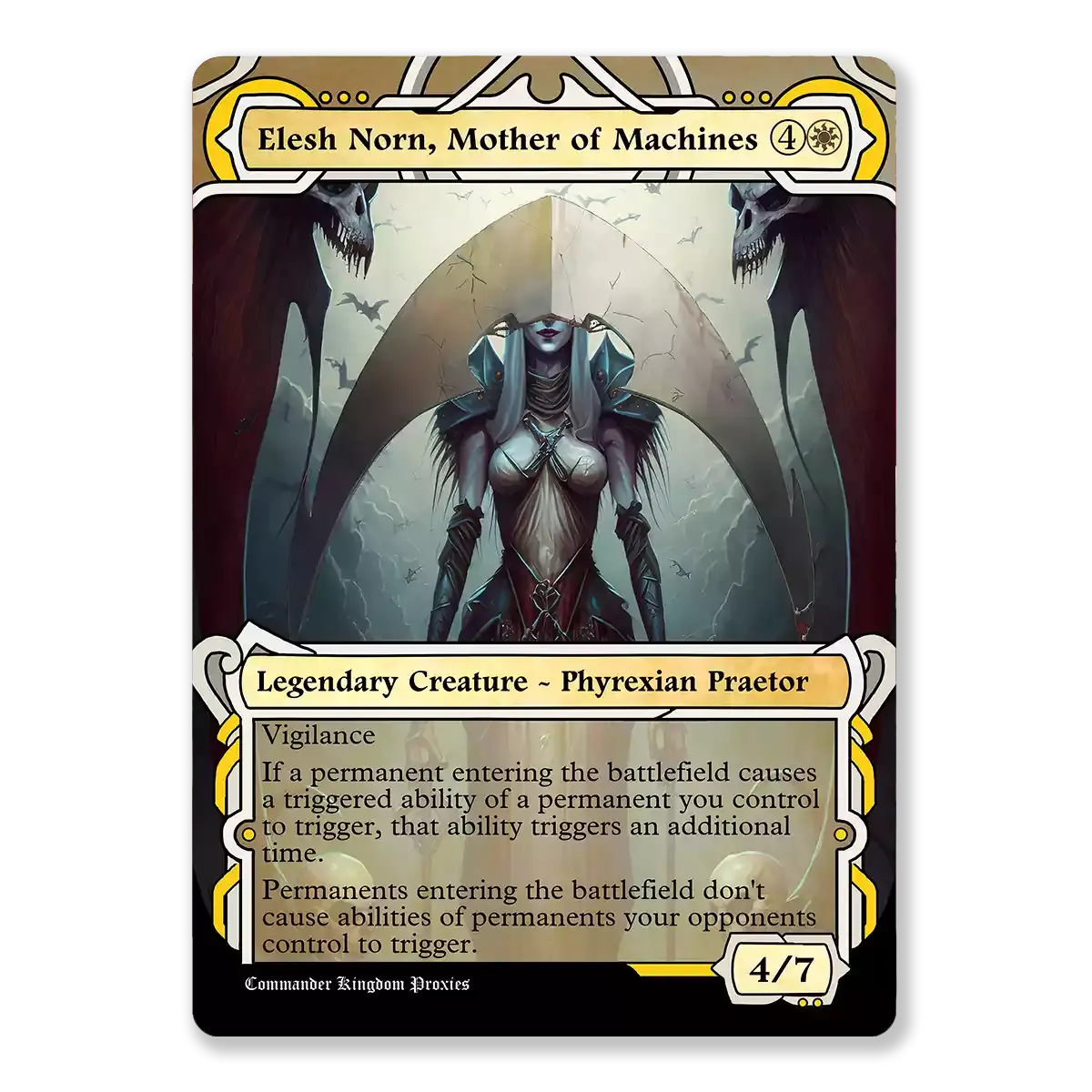
Modern template
Pick Modern when you want the default MTG look
The Modern frame is the “I don’t want surprises” option. It’s clean, familiar, and readable across basically every card type. If you’re building a full Commander deck, a cube update, or a big stack of playtest cards, Modern is the template that will not betray you.
Use Modern for:
Full deck builds where consistency matters
Cards with lots of rules text
Anything you expect other players to read quickly across the table
You give up:
A bit of personality. Modern is the jeans-and-t-shirt of templates. It works. It’s not trying to win an art contest.
Vintage template
Pick Vintage when you want old border nostalgia (not the Vintage format)
Let’s clear the classic confusion: Vintage template means old-border style, not “this card is for the Vintage format.” You’re choosing a look, not a lifestyle.
Vintage templates are perfect when you want your deck to feel like it crawled out of a 1999 shoebox in the best possible way. The old border has a distinct vibe: more frame texture, more “classic Magic,” and a lot of warm nostalgia energy.
Use Vintage for:
Old-school themed decks
Retro cubes or throwback draft nights
Iconic cards that feel right in old border
You give up:
Some breathing room. If you’re printing a wall of rules text, Vintage can feel more cramped than Modern.
Tiny pro tip: if you’re doing Vintage, commit. A few old-border cards in a sea of Modern can look like your deck got dressed in the dark.
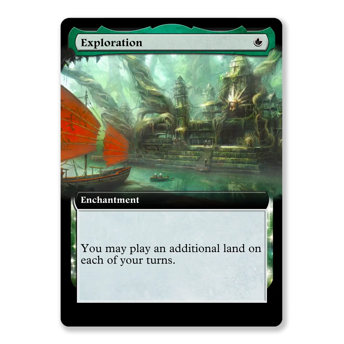
Full Art template
Pick Full Art when the artwork is the point
Full Art is your “let the art cook” template. This is where lands shine, commanders become posters, and your deck suddenly looks like you paid attention to aesthetics.
But Full Art has one hard rule: text still has to be readable. If your card has five lines of rules text and three triggered abilities, Full Art is going to feel like you’re trying to write a novel on a movie poster.
Use Full Art for:
Basic lands (the safest, cleanest use)
Simple permanents with short text
A few splashy “centerpiece” cards
You give up:
Text box comfort. Full Art works best when you’re not forcing it.
If your Full Art card looks hard to read on screen, it will not magically become easier in print. Paper does not do favors. It just judges silently.
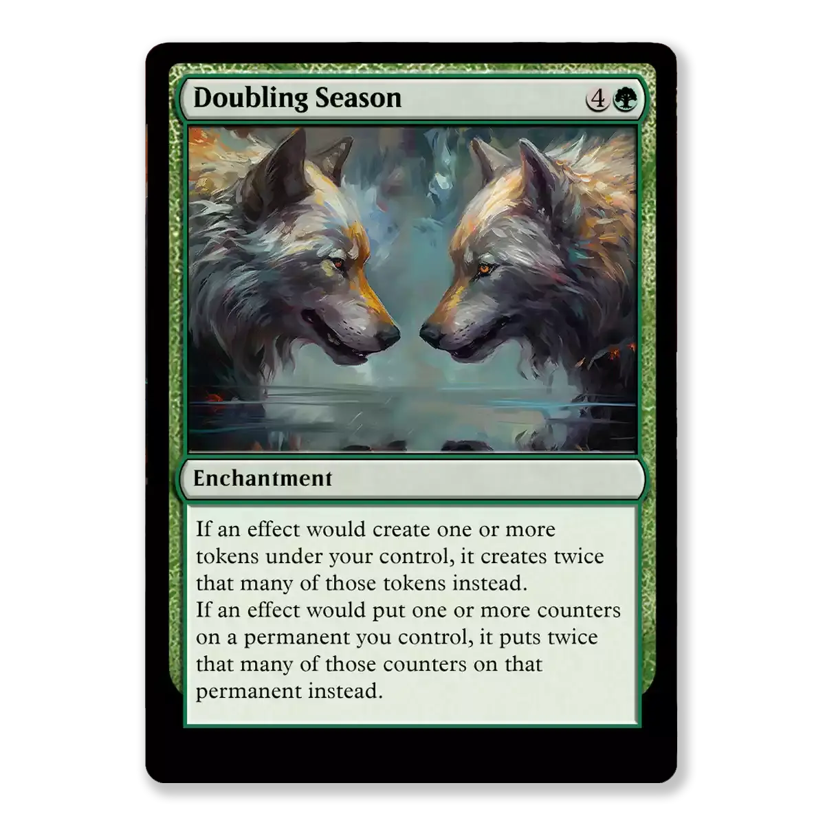
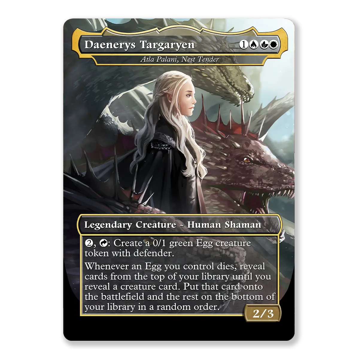
Showcase templates
Pick Showcase when you want the card to feel like a special treatment
Showcase is the big umbrella category: themed frames, premium vibes, set-inspired styling. These are the templates you use when you want a deck to feel curated, not just assembled.
On PrintMTG, Showcase-style choices often map cleanly to templates like Box Topper and Mystical Archives. Think of them as two flavors of “special.”
Box Topper style
Box Topper templates tend to feel premium and clean, with more emphasis on art and a “collector” look.
Use Box Topper for:
Your commander
Staples you want to highlight (the cards you’re always happy to draw)
Big, iconic spells that deserve a little drama
Watch out for:
Art cropping. Bigger art presentation means the crop matters more. Choose art that still reads well when zoomed.
Mystical Archives style
Mystical Archives has a very specific vibe: spellbook, illuminated manuscript, fancy wizard stationery. It’s a perfect fit for instants and sorceries, especially ones you want to feel mythic.
Use Mystical Archives for:
Instants and sorceries (it’s basically their natural habitat)
Signature interaction spells
“This deck is about magic spells” decks, which is technically all of them, but you know what I mean
Watch out for:
Busy backgrounds. This template is designed to look ornate. Pair it with art that won’t fight the frame.
The “don’t overthink it” template plans
If you want a simple default that still looks great:
Plan A: The clean deck plan
Modern for 90% of the deck
Full Art for lands
Showcase for commander + 5 favorite cards
It looks cohesive, reads easily, and still has personality. Also it prevents you from making every card a different special frame, which turns your deck into a slideshow.
Plan B: The nostalgia plan
Vintage for the whole deck
Full Art lands only if you want the contrast
Showcase sparingly (Vintage decks with modern Showcase frames can clash)
Plan C: The “I love bling” plan (with guardrails)
Modern as the baseline
Showcase for key cards
Full Art for lands and a couple of showpieces
Try to keep it to 2–3 template styles total so it still feels like one deck, not a binder page.
Printing notes that actually matter
Templates aren’t just vibes. They’re layouts. Layouts behave differently in print.
A quick sanity checklist before you hit order:
Contrast wins games. If your text is sitting on a bright or busy background, it’s going to suffer.
High-res art helps. If your art is tiny or compressed, print will politely expose it.
Avoid edge-hugging details. Borderless and Full Art looks best when important elements are not trapped at the very edge.
Preview like a stranger. If you can’t read it instantly, your table probably can’t either.
On PrintMTG specifically, we enhance images on the backend and print on premium equipment (press, UV coating, consistent die cutting), so your chosen template actually shows up the way you intended. Your art file still matters, but the production side won’t sabotage you.
Use the template in the MTG Card Maker and go
This is the easy part:
Open the MTG Card Maker.
Pick Modern, Vintage, Box Topper, Mystical Archives, or Full Art from the template selector.
Upload art, tweak the layout, preview, and you’re done.
That’s it. No ritual required.
FAQs
Does “Vintage template” mean the Vintage format?
No. It’s the old-border look, not a format declaration. Your card is not suddenly wearing a monocle.
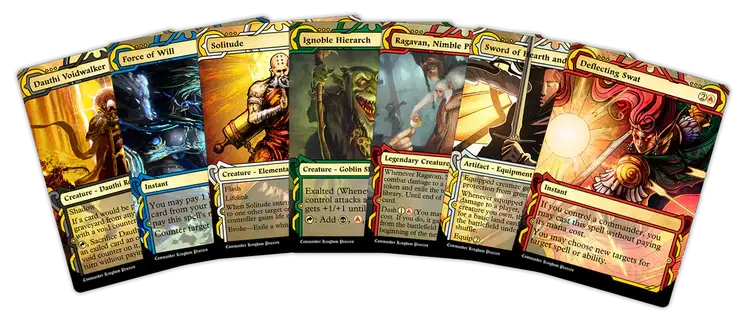
Can I mix Modern, Vintage, Full Art, and Showcase in one deck?
Yes, but it looks best when you limit the chaos. Most decks feel cohesive with 2–3 template styles max.
What’s the difference between Full Art and Showcase?
Full Art is about maximizing art and minimizing borders.
Showcase is about a themed frame treatment that matches a particular style or set vibe.
What template should I use for cards with tons of rules text?
Modern almost every time. Clean text boxes exist for a reason.
What’s the easiest “upgrade” that makes a deck look better instantly?
Full Art lands. You’ll see them constantly, and they don’t need to carry paragraphs of rules text.