
This post helps MTG players keep a proxy deck consistent by explaining why some cards print darker than others, how to normalize brightness and contrast, and how to soft proof before ordering, so the whole deck looks like it was printed on purpose.
TLDR
If your proxies don’t match, it’s usually mismatched source images and crushed shadows, not “because it wasn’t CMYK.”
Cards with dark frames, heavy blacks, and moody art are the most likely to print dark (shadow detail disappears first).
Pick a target look, then normalize the deck with the same Levels/Curves approach across every card.
Soft proofing is how you stop gambling. It won’t be perfect, but it will prevent the “why is this card in witness protection” moment.
If you want the easy mode: print a small test batch before you commit to 100 cards.
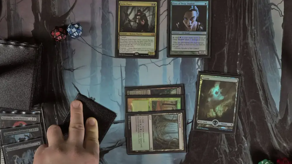
You know that feeling when you lay out your freshly printed Commander deck and it looks like it came from three different timelines?
Half the cards are bright and crisp. A few are a little muted. And then there’s that one card that looks like it was printed inside a trench coat at midnight.
That’s the problem we’re solving here: keeping a proxy deck consistent, so your deck looks cohesive in sleeves and plays clean, instead of looking like an art school group project.
Color consistency isn’t a checkbox (and it’s not just “is it CMYK”)
Printing uses CMYK inks, sure. But “convert to CMYK” is not a magical spell that makes 100 different images behave.
Most deck mismatch problems come from three places:
1) Source mismatch
If your deck images come from different places, they come with different “baked in” decisions:
Different scans or compressions
Different sharpening
Different color profiles (or none at all)
Different black levels and contrast curves
You can’t “CMYK” your way out of that. You have to normalize.
2) Contrast mismatch
Even if the colors are technically fine, your tonal range can be all over the place:
One card has lifted shadows and looks airy
Another has crushed blacks and looks dramatic
Another has midtones so flat it looks like a fog machine went off
Your eye reads that as “these cards don’t match.”
3) Substrate reality
Paper and finish matter. Some stocks and coatings hold detail better, some make dark areas look heavier (and yes, this is where dot gain and ink behavior show up). If you ignore this, your screen will keep lying to you.
The quick diagnosis: what kind of mismatch do you have?
Use this mini-checklist. It tells you what to fix first.
Only a few cards are dark → Those specific images have crushed shadows, heavy blacks, or a different source/processing.
Everything is darker than your screen → Your monitor is too bright, and you’re editing for a backlit display, not reflective paper.
Dark frames look extra dark (black, artifact-heavy, full-art with deep shadows) → You’re losing shadow detail to print behavior and your files aren’t compensating.
Cards vary in “pop” more than brightness → You’ve got inconsistent contrast and saturation, not just exposure.
Now let’s fix it.
Keeping a Proxy Deck Consistent: Matching Brightness and Contrast Across Cards
Here’s the practical workflow that actually scales to a whole deck.
Step 1: Pick a target look (your deck needs a “north star”)
Choose 3–5 cards in your deck that represent what you want the whole deck to feel like:
One bright card (white or light background)
One midtone card
One dark card (black frame, night scene, deep shadows)
One “problem child” card that has lots of detail in shadows
This becomes your consistency reference. Otherwise you’ll keep “fixing” cards in random directions until you’ve invented five new problems.
Step 2: Normalize the tonal range first (before you touch saturation)
If you do one thing, do this:
Protect highlights (so whites don’t blow out)
Lift shadows slightly (so detail survives print)
Set a consistent black point (so your blacks aren’t 12 different kinds of black)
In editor terms, this is usually a Levels or Curves move:
Bring the darkest blacks up a hair (so shadow detail isn’t crushed)
Bring midtones into a consistent range across cards
Avoid “pure black everywhere” unless you want the card to print like a void
If your deck is inconsistent, it’s usually because your black point is inconsistent.
Step 3: Use one “deck adjustment” whenever possible
If you’re building proxies from your own files (custom frames, custom art, your own renders), don’t edit each card like it’s a precious snowflake.
Instead:
Create a single adjustment layer/group (Levels/Curves + a gentle saturation tweak if needed)
Apply it consistently
Then only do small per-card exceptions when necessary
This is how you get a deck that looks intentional instead of “99 individual decisions.”
Step 4: Watch the frame, not just the art
MTG frames are sneaky. The art can look fine, but the frame may be doing the damage.
Common frame-related offenders:
Large black borders or heavy dark gradients
Dark rules text areas that “plug up”
Full-art cards where the “frame” is essentially more art, meaning more ink everywhere
Your fix is usually not “make everything brighter.” It’s “make sure shadow detail survives where it matters.”
A good rule: prioritize readability over drama. You want your deck to play well, not to win an art grading contest.
Step 5: Stop mixing random file types and profiles
If some cards are PNGs from one source, others are JPEGs from somewhere else, and a few are screenshots… your results will show it.
Pick a consistent approach:
Consistent resolution (don’t upscale tiny images and expect miracles)
Consistent export settings
Embed color profiles when exporting (so software doesn’t guess)
“Software guessing” is how you get surprise shifts.
Why Some Cards Print Dark: Frames, Contrast, and Shadow Detail
Let’s talk about the classic complaint:
“My proxies printed darker than they looked on screen.”
Yep. Because screens glow and paper reflects. But there’s also a printing phenomenon that makes it worse: dark tones tend to expand and lose detail on paper, especially when the file already has tight shadows.
That shows up as:
Shadow detail vanishing (hair, folds, clouds, textured stone)
Dark frames looking heavier than expected
“Muddy” blacks where everything becomes the same dark blob
The three biggest “prints dark” culprits
1) Crushed shadows in the source image
If the file already has clipped blacks, print will not resurrect them. Print makes that problem louder.
2) Heavy total ink coverage in dark areas
Big regions of near-black are hard. They love to become one flat mass unless you manage them.
3) Dot gain and paper behavior
Ink dots can effectively “spread” and appear heavier on paper. The result reads darker and can reduce fine detail.
The fix that works most often: lift shadows, don’t blast brightness
You typically want:
Slightly lifted blacks
More separation in the darkest 20 percent of tones
A calmer contrast curve
If you brighten the whole card, you’ll wash out highlights and still lose shadow detail. Lifting shadows is targeted and usually keeps the card looking like itself.
And yes, this is also why cards with black frames and night art are the first ones to betray you.
Soft Proofing 101: How to Predict Print Color Before You Order
Soft proofing is just a fancy phrase for:
“Show me what this will look like when it stops being a glowing screen and becomes ink on paper.”
It’s not perfect. But it turns wild surprises into manageable adjustments.
What you need for accurate soft proofing
Best case:
A reasonably calibrated monitor (or at least not set to nuclear brightness)
An ICC profile for the intended print condition (printer + paper)
If you don’t have a printer profile, you can still do a “rough proof” by checking shadow detail and dialing back your expectations for deep blacks. It’s still better than nothing.
Soft proofing in Photoshop (quick version)
In general terms:
Choose a proof setup for the output condition
Toggle proof colors on and off to see what shifts
Check shadow detail and overall contrast
Make adjustments while proofing so the final print matches your intent
Soft proofing in GIMP (free tool option)
GIMP supports soft proof profiles and proof color viewing. If you’ve never used it, don’t worry. You’re not “behind.” You’re normal.
The practical PrintMTG approach: proof the deck like a sane person
If you’re ordering a full deck and you care about consistency:
Print a small batch first (including your darkest cards)
Adjust based on real output
Then print the full deck
It’s boring. It works. Boring is underrated.
A simple “Good / Better / Best” consistency plan
Good: Stop the worst mismatches
Use consistent source images
Normalize brightness and contrast (Levels/Curves)
Avoid crushed blacks
Cost: minimal time
Tradeoff: still some variation, especially in very dark cards
Better: Do a basic soft proof check
Soft proof key problem cards
Fix shadow detail first
Keep exports consistent and profile-tagged
Cost: a bit more time
Tradeoff: still not a perfect simulation without a print profile
Best: Proof batch + calibrated screen habits
Calibrate or at least lower monitor brightness
Soft proof with appropriate profiles when available
Print a small test batch before the big run
Cost: time and a small test order
Tradeoff: you’ve become the person who says “I tested it” and you’ll never be cool again (but your deck will look great)
Common mistakes that make decks look mismatched
Editing cards one-by-one without a shared target look
“Fixing” dark cards by cranking brightness until highlights clip
Mixing wildly different art styles and expecting them to feel uniform
Assuming CMYK conversion is the real fix
Ignoring shadow detail (the first thing print eats)
FAQs
Why do my MTG proxies print darker than my screen?
Most screens are brighter than print viewing conditions, and dark tones can lose detail on paper. If your source image already has crushed shadows, print will make it more obvious.
Should I convert my proxy files to CMYK?
Not always. Converting without the right profile can create shifts. The bigger win is consistent source images, consistent exports, and controlling shadows and contrast.
Why do black frames and dark art look worse?
They’re heavy on blacks and deep shadows, which are the first areas to lose separation in print. You usually need slightly lifted shadows to keep detail.
What’s the fastest way to make a deck look consistent?
Pick a target look, apply one consistent Levels/Curves approach across the deck, and only do small exceptions where needed.
Can proxies be made to look exactly like real MTG cards?
The goal here is consistent, readable play pieces, not making something to deceive anyone. Proxies are for casual play and playtesting where allowed, not sanctioned tournament play.