
TLDR
MTG art is “rules text you can feel,” it teaches mechanics, sells worldbuilding, and makes cardboard worth caring about.
Modern Magic art is tightly coordinated through set style guides, Booster Fun frames, and (increasingly) franchise crossovers.
Wizards has doubled down on human-made art standards while publishing clearer guidance around generative AI concerns.
In 2025 and 2026, Universes Beyond and new showcase treatments keep stretching what “a Magic card” can look like, without (usually) breaking the vibe.
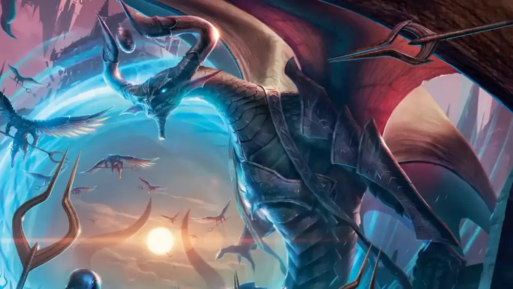
Magic: The Gathering is a strategy game, sure. It is also a 30-plus year art gallery that just happens to come with a combat step.
If you have ever kept a “bad” rare because the illustration slapped, you already understand the assignment. The art does a weird amount of heavy lifting: it sells the fantasy, signals what a card does, and quietly convinces you that opening packs is “basically cultural enrichment.”
How MTG art grew up
Early Magic (1993 era) had a charming chaos to it. The visual identity was not unified because it basically could not be. Different mediums, different artists, different levels of polish. Sometimes you got moody realism. Sometimes you got “my uncle painted this in a basement and it rules.”
Over time, Magic’s creative team tightened the screws. Worldbuilding became more deliberate, and art direction started enforcing cohesion set by set. By the late 90s and into the modern era, cards stopped feeling like a pile of unrelated illustrations and started feeling like snapshots from a shared place.
That shift is why you can glance at a random card and think, “This is Innistrad,” or “This is Ravnica,” without reading a word. Your brain recognizes architecture, lighting, clothing shapes, and creature silhouettes the same way it recognizes a movie genre.
The best Magic art teaches you the card before you read it
Mechanics are abstract. Art is not. When the two line up, the card becomes instantly legible.
A good piece of Magic art usually answers at least one of these questions:
What is happening right now? (attack, ambush, ritual, catastrophe)
Who is in control? (mage, monster, army, weird object that should not be alive)
What does this feel like? (speed, dread, inevitability, chaos, relief)
That is why certain staples imprint on you. It is not just because the card is efficient, it is because the image makes the effect obvious. Removal looks like removal. A pump spell looks like a pump spell. A counterspell looks like “no, you do not get to have fun.”
A quick “read the art” checklist
Next time you see a new card, try this:
Find the focal point. What is the illustration forcing your eyes to look at first?
Check the motion. Is the composition pushing forward (aggression) or pulling inward (control, trickery)?
Look for the consequence. What changed because of this spell or creature existing?
Match the mood to a color. Does it feel like white order, blue precision, black ambition, red impulse, green inevitability?
Then read the rules text. You will be surprised how often you were already close.
Worldbuilding is a visual language, not a lore dump
Magic’s planes work because they are designed like places with consistent visual rules. Innistrad reads as gothic horror because of its palettes, silhouettes, and lighting choices. Ravnica reads as a dense metropolis because everything is vertical, symbolic, and faction-coded.
In the past couple of years, Wizards has leaned even harder into set-specific visual treatments that reinforce theme. Duskmourn’s “double exposure” look is a great example of style doing storytelling work, not just decoration. When a frame and print treatment makes the horror concept land faster, that is art direction winning.
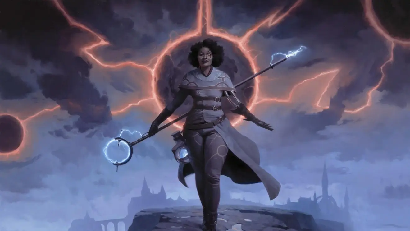
Notable Artists and Signature Styles
Magic has brought in talented artists over the years, and some have become household names in the community. Terese Nielsen’s ethereal approach, for instance, helped establish the look of iconic cards, especially when Magic was building its reputation. Her work often blends realistic figures with a certain dreamlike quality, setting a mood that makes you pause to take it all in.
John Avon, meanwhile, is known for his landscapes. If you’ve played Magic for any length of time, you’ve probably seen one of his lands. His sweeping vistas are so detailed they practically transport you to that place. You can imagine the climate, the smells, and the sensation of standing there, gazing at a waterfall or a twisting forest path. Then there are artists like Seb McKinnon, whose style is sometimes surreal and haunting, and Steve Argyle, who leans into crisp, dynamic details. Each brings a distinct flavor to the game. That variety, all orchestrated by the art directors, makes Magic feel like it has its own living ecosystem of styles.
Booster Fun made card frames part of the storytelling
In 2026, “the art” is no longer only the illustration box. Frames, foils, alternate treatments, and special print styles now carry theme too.
This is the part where some players cheer and some players sigh and start muttering about how they miss when a rare was just a rare.
But from a storytelling perspective, Booster Fun is powerful: it lets a set communicate tone through the entire card object. Retro frames trigger nostalgia. Borderless treatments turn characters into posters. Showcase frames codify the set’s visual identity in one glance. Headliner-style chase treatments take that to the logical extreme.
Art also shows up in more “collect the vibe” formats, like art cards in premium products. It is essentially Wizards admitting what we all knew: sometimes you just want the picture.
Going digital, staying human
Most Magic illustrations today are created digitally or through hybrid workflows (traditional sketching, digital paint, 3D references, photobash elements). That is not a downgrade. It is mostly a production reality: consistency, revision control, and collaboration at scale.
The real 2026 tension is not “traditional vs digital.” It is “human-made vs machine-generated.”
Wizards has publicly reaffirmed that final Magic creative work should not be generated by AI tools, and they have also published clearer guidance for how they assess and respond to generative AI concerns. That matters to players because trust is part of collecting. If you are paying for art-driven variants, you want to know an actual person made the thing you are admiring.
Universes Beyond: the art director’s hardest mode
Universes Beyond is now a permanent part of Magic’s visual ecosystem. And like it or not, it has forced Magic’s art direction to become even more flexible.
Adapting an outside franchise is harder than just “draw the character.” You have to:
respect the source material’s visual rules
make it readable as a Magic card at table distance
integrate it into Magic’s color and composition language
keep the tone consistent with the set’s product goals
When it works, you get a crossover card that feels like it belongs in a deck next to in-universe staples. When it does not, it feels like an ad wandered onto your battlefield and started giving you combat math.
Commercially, the crossover wave has been enormous. The Final Fantasy collaboration set a new bar for demand, which also means more pressure on visuals to satisfy both Magic players and franchise fans who will absolutely notice if you get a beloved character “slightly off.”
What to watch in 2026
If you want a practical way to track where Magic art is going, here are the trend lines that actually matter:
More treatment-driven storytelling. Print styles and showcase frames are now part of set identity, not garnish.
More “event” releases. Big tentpole sets and collaborations push art toward poster-level clarity and iconography.
More deliberate nostalgia. Retro frames, throwback styles, and classic world returns keep cycling because they work.
More spotlight on specific artists. Alternate treatments and special variants increasingly feel like curated gallery drops.
If you want a current example of Magic leaning into “art as the headline,” look at how 2026’s return to Lorwyn is being framed (visually and literally) as a distinct aesthetic moment.
Conclusion
Magic endures because it keeps finding new ways to make a card feel like a tiny window into a world. Art is the bridge between rules and imagination. It teaches the game, sells the setting, and turns a shuffled deck into a personal museum you can play with.
In 2026, the visuals are more coordinated, more experimental, and more productized than ever. That can be messy. It can also be genuinely cool. The best part is that the core magic (yes, I said it) still works: you see an image, you feel a story, and suddenly you care what happens next.